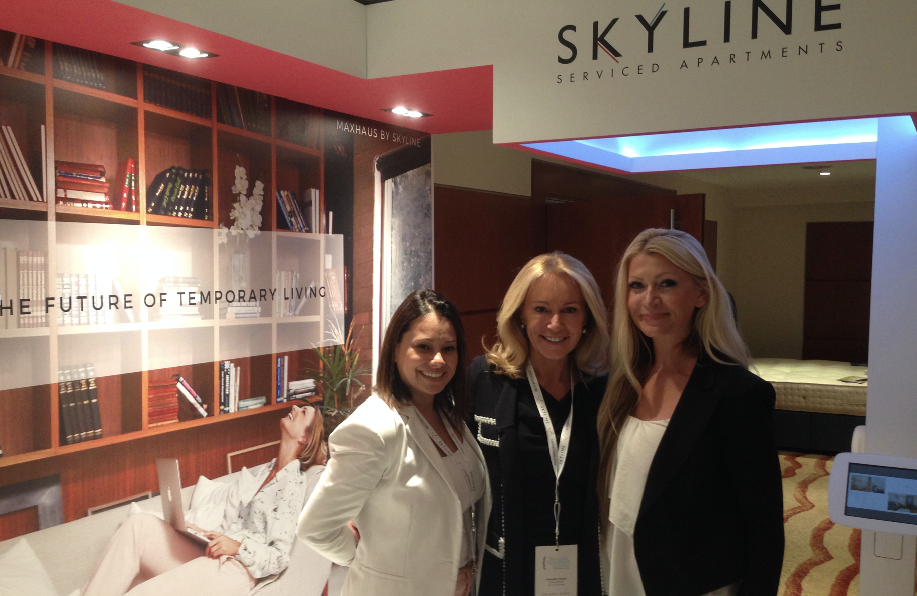
Skyline Worldwide will be unveiling its new brand identity at the Serviced Apartment Summit on July 7th and 8th at the Park Plaza Victoria, London.
The company says its new branding reflects “the values, mission, direction and strengths of this increasingly expanding company, including its unique and leading position in the rapidly growing international serviced apartment marketplace”.
Thiago Hahn, CEO and director of Skyline Worldwide, said: “Our passion and our mission is in uniting people with their ideal accommodation and making each and every guest feel special. Whatever their requirements and wherever they wish to be, we at Skyline Worldwide use our best endeavours and a consultative approach to show our clients we truly understand what matters to them. We feel our new and creative branding reflects our company’s innovative ideals, at the same time emphasises our commitment to providing a supremely dynamic standard of accommodation and high service levels.”
In conjunction with the new branding, Skyline is also launching an enhanced website which includes, amongst numerous other features, a supplier portal, a quote system and an email generation system, all optimised for desktop, mobile and tablet devices. The new systems will go live in August 2015. Following this, Q4 2015 will see the company launch its new online client platform.
The company said: “The Serviced Apartment Summit’s theme this year is ‘Accommodating the Future’, a concept which effectively defines the Skyline Worldwide approach as encapsulated in our strap line, ‘Welcome to the future of temporary living’.”
The company’s new corporate identity was designed by Jonathan Wilkins, founder and creative director of London-based digital design agency Studio Blup, whose clients include Nike, Lacoste and Dolce & Gabbana.
“The new branding features a distinctive two-lined symbol. Each line is set at an angle, matching those which make up the letters ‘K’ and ‘Y’ in the Skyline name. One is red and one is blue, each mutually reinforcing the other in a synergistic relationship. The symbol represents the dual nature of Skyline’s stance, aligning quality and service with trust and technology to point the way to the future of temporary living. Standing out boldly, it also reflects the company’s distinctive and innovative approach and their rising prominence,” it says.
liveskyline.com</p


