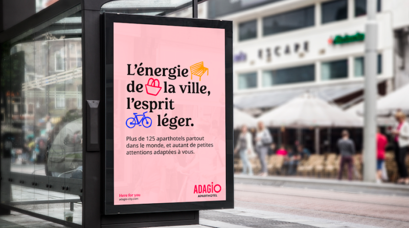
UK: Adagio has undergone a rebrand to “illustrate a collection of new messages encompassing Adagio’s purpose, promise, mission, values and proof of achievements”.
Adagio’s rebrand has been created by branding agency Saguez & Partners. The agency took inspiration from artists known for their bold use of colour including Matisse and David Hockney. The colour palate includes bright tones of orange, turquoise, pale pink, purple and black alongside the brand’s original red.
Central to the rebrand is the Creative City Map, that represents the modern city landscape within which Adagio properties are located.
Karine Eisenchteter Léothier, director of strategy and innovation at Saguez & Partners said: “We have revealed a powerful, modern and light brand. We are very happy with the result, which lives up to our common ambition: to reveal the brand’s potential, to change the perception of Adagio by placing it in a modern context with a rich and lively territory.”
Laurène Rohr, head of marketing at Adagio said: “We are delighted to reveal our new brand platform which is a concise expression of Adagio’s identity. Our aim with this modern new look is to take Adagio into a new phase. We want to reach new customers as well as nurture our existing ones through our new messages and branding which are key to our continued growth in the aparthotel and wider travel sector”.
Adagio’s new branding can be seen across both digital and out-of-home advertising including website, social media, billboards, and on branded merchandise from January.


